
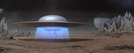
Here's the most junior member of our family alongside an appropriately junior-sized submarine, spotted in Brighton recently. I liked this sub, clearly inspired by art director Harper Goff's design for Captain Nemo's "Nautilus", as used in Walt Disney's 1954 version of "20,000 Leagues Under the Sea".
Apparently, Walt Disney originally wanted the "Nautilus" to be a simple cigar-tube shape, but after seeing Goff's prototype model of a more elaborate and compelling design, he changed his mind. The resulting film "Nautilus" looked fantastic - shaped like a great fish, clad in metal plates and rivets, embellished with spiky Victorian gothic details.
 |
| Image courtesy of WikiFred |
Isn't she a beauty? There have been countless different attempts to visualise Jules Verne's "Nautilus" over the years, (including tinplate toys - I had one like this as a kid) but Goff's powerful design still blows me away.
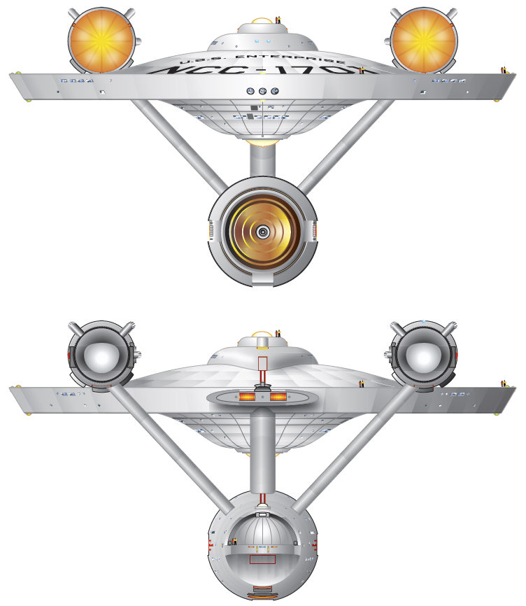
Before he saw Goff's more visually exciting design, Walt Disney imagined that the film version of the "Nautilus" would obviously confirm to the canonical "cigar tube" submarine shape. A similar thing happened during the design of another pop culture classic - the starship "Enterprise" from "Star Trek". Again, there were preconceptions about what it should look like at the design stage. Gene Rodenberry knew the look he didn't want Enterprise to have - the streamlined bullet-with-fins appearance shared by early pulp fiction rocketships and the V2 missile. This design, Rodenberry decided, was hackneyed and not futuristic enough for a 23rd Century starship.
At that time there was an alternative generic design for science fiction spaceships. If they didn't look like rockets with fins, they reflected the current flying saucer hysteria. Think of the spaceships from "Lost in Space" or "Forbidden Planet". "Star Trek" art director Matt Jefferies started off doodling flying saucer shapes, rejected that idea, thought about his design from an engineering perspective, finally coming up with a synthesis of a modular design with the saucer shape that just looked right. In his own words:
I gathered that this ship had to have powerful engines—extremely powerful. To me, that meant that they had to be designed away from the body. Boy, I tried a lot of ideas. I wanted to stay away from the flying saucer shape. The ball or sphere, as you’ll see in some of the sketches, was my idea, but I ended up with the saucer after all...
[F]or the hull, I didn’t really want a saucer because of the term flying saucer, and the best pressure vessel of course is a ball, so I started playing with that. But the bulk got in the way and the ball just didn’t work. I flattened it out and I guess we wound up with a saucer! I did it in color on a black matt board, and by the time I finished I thought we really had something. [...] And that worked! It looked better than the other sketches and Gene said, “That one looks good!”
And it does look good. You can criticise aspects of the design on the grounds of plausibility,* but on the screen it does look right. The "Enterprise" looks distinctive, purposeful, futuristic and powerful. It's such a well-known image that it's sometimes hard to recognise it for what it is - in purely aesthetic terms, probably the best-looking fictional spaceship ever to have graced the small or big screens.

One thing that the Disney "Nautilus" and the "Star Trek" "Enterprise" have in common is their distinctive outline. Even in silhouette, they're unmistakable. I think that has a lot to do with the visual magic of the designs - a power they share with, among others, Bart Simpson, Batman and Mickey Mouse. Let "The Simpsons" creator, Matt Groening, explain:
The secret of designing cartoon characters — and I’m giving away this secret now to all of you out there — is: you make a character that you can tell who it is in silhouette. I learned this from watching Mickey Mouse as a kid. You can tell Mickey Mouse from a mile away…those two big ears. Same thing with Popeye, same thing with Batman. And so, if you look at the Simpsons, they’re all identifiable in silhouette. Bart with the picket fence hair, Marge with the beehive, and Homer with the two little hairs, and all the rest. So…I think about hair quite a lot.
USS Enterprise plan courtesy of alpoma's Flikr photostream
* Update - I didn't expand on the "plausibility" aspect as FTL travel is - as far as most scientists and engineers are concerned - fantasy and, anyhow, anybody alive now (or in the 1960s) has/had as little chance of imagining what real 23rd Century tech might actually look like as those quaint 19th Century illustrators of life in the 21st Century had of accurately predicting the look and feel of today's world. But I think I need to share the easily fixable thing that bugs me about the design of the Enterprise from the original series. Namely, the way that the engines seem to be obviously mounted above the craft's centre of mass, which makes no sense. This also bothered Andrew Probert, who designed the new Enterprise for the Next Generation series and mounted the engines in a more plausible-looking position.
I still prefer the look and feel of the Enterprise from the original series - I like the unstreamlined deep space vessel aesthetic better than the go-faster flared stylings of the NCC-1701-D and I think the flashy up-to-the-minute blue lights on the newer vessel will date more quickly than the restrained details on the original version (I particularly like the coppery colour of the deflector dish thingy from the old Enterprise). But they really should have got those engines looking right.


#/media/File:Enterprise_Forward.jpg)
0 comments:
Post a Comment